VCF Operations | Ideas for Practical and Effective Dashboards
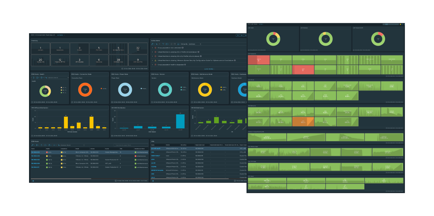
Sample Dashboard Designs to review first thing in the morning while drinking your Coffee or Energy Drink.
If you have an apple and I have an apple and we exchange these apples, then you and I will still each have one apple. But if you have an idea and I have an idea and we exchange these ideas, then each of us will have two ideas. — George Bernard Shaw
Out of the box (OOTB), VCF Operations provides many great dashboards. Some questions I frequently get from customers are:
- “What else can we monitor with VCF Operations?”
- “How do I show settings that are most important to my environment?”
- “How do other customers use VCF Operations?”
I always recommend that customers create a list of their (5) favorite dashboards and pin them to the VCF Operations homepage. That way, each morning, as you enjoy your coffee or energy drink, you can get an at-a-glance view of your infrastructure environment.
When designing dashboards, always consider using colors to enhance their functionality—green indicates all is well, while red signals issues that may need attention.
In this blog post, I’ll share some screenshots of dashboards that my team or myself have created and used or helped customers implement in their environments. As you review these examples, think about combining sections from different dashboards to create one that covers everything important to you. This way, you’ll have a go-to dashboard you’ll want to check every morning with your favorite wake me up drink in hand.
The main goal of this blog post is to provide visual inspiration for what’s achievable with Operations Dashboards.
Dashboard Ideas:
- Environment
- Configuration
- Status
- Counts
- Mobile Friendly
Dashboard Screen Shots:
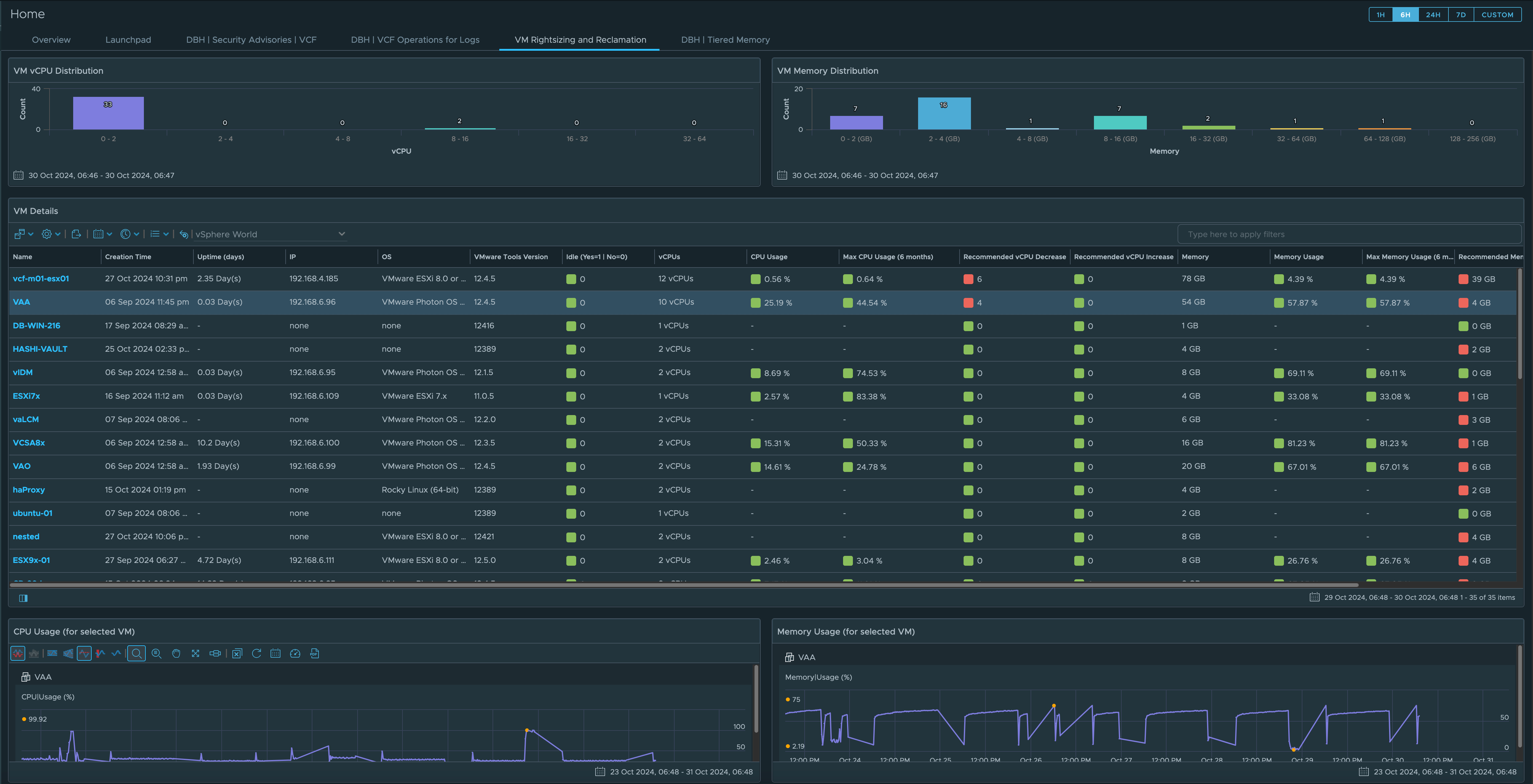
Dashboard: VM Rightsizing
- Always one of my favorite use cases
- Shows recommended size for CPU and Memory
- Include the metrics to show why CPU Count should be increased or decreased
- Include the metrics to show why Memory Amount should be increased or decreased
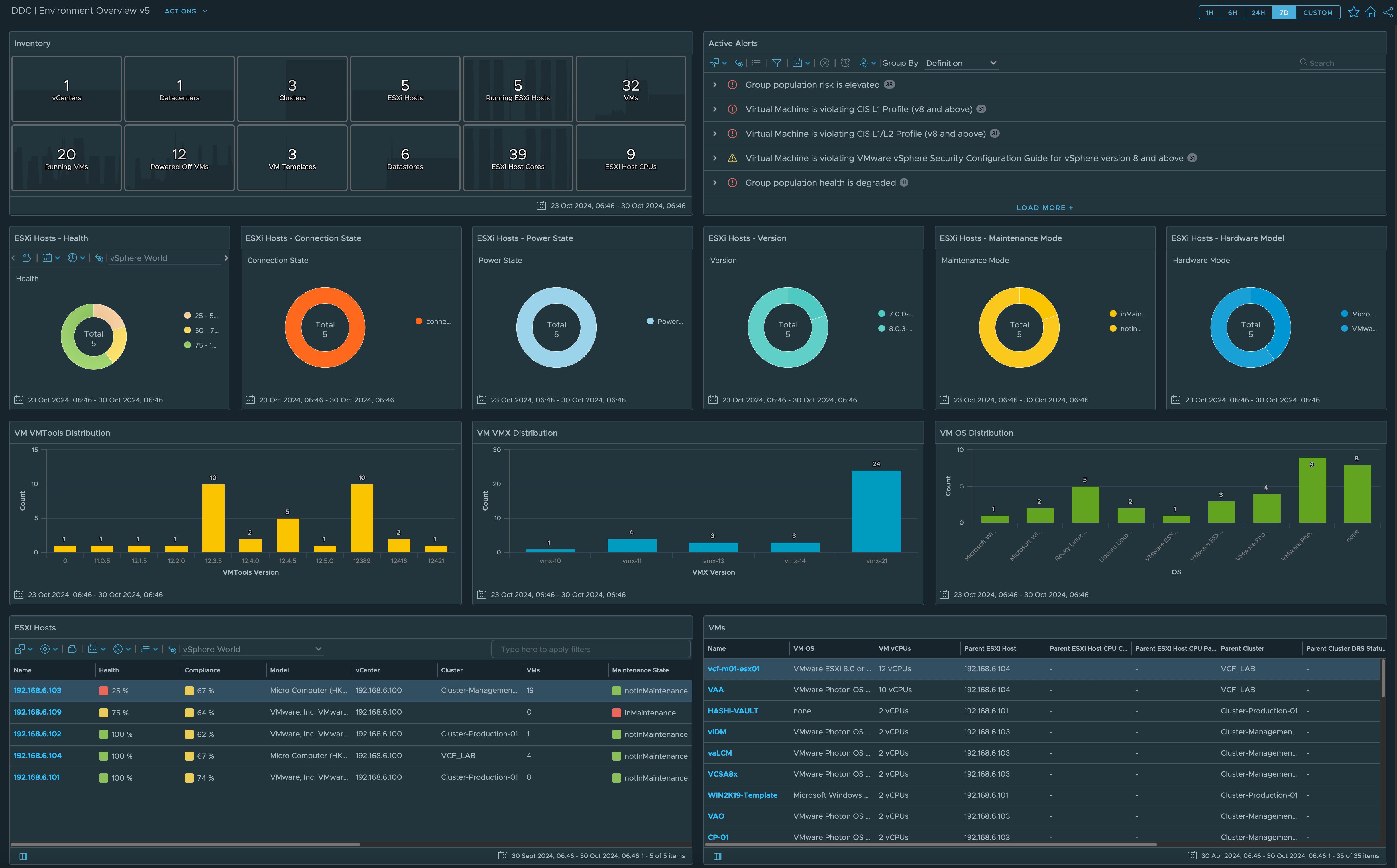
Dashboard: Environment Overview
- Show Total Inventory Counts
- Include Alerts that should be reviewed
- VMware Tools Versions
- VM OS
- Hosts Health, Connection State, Power State, Version, Maintenance Mode Status, etc…
- Show Host Health in descending order to get you attention
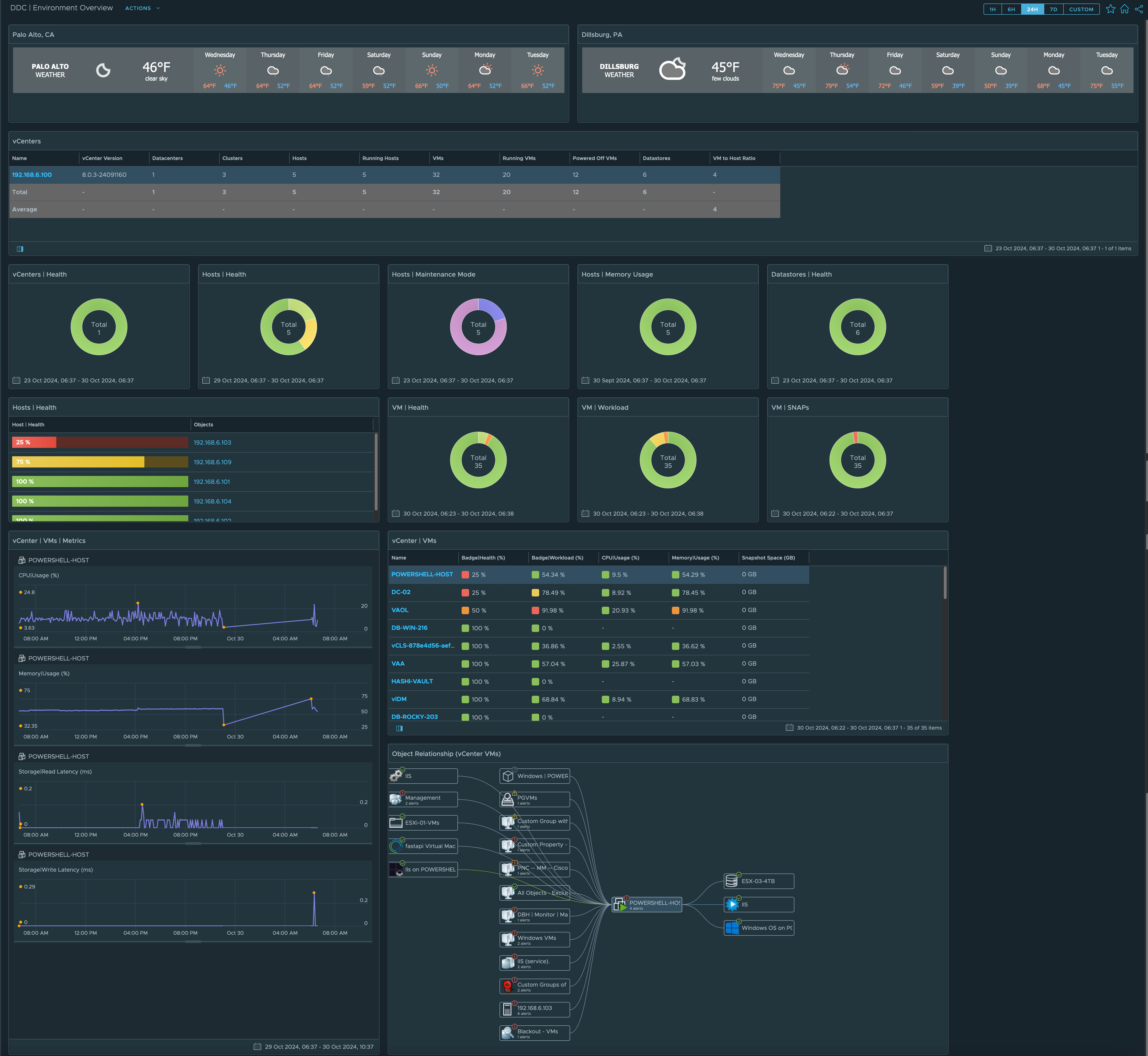
Dashboard: Environment Overview
- Show Weather at your data center physical locations
- Include Health, Maintenance Mode, Workload, Snaps, Etc…
- Object Relationship shows what other objects could be affect VM performance
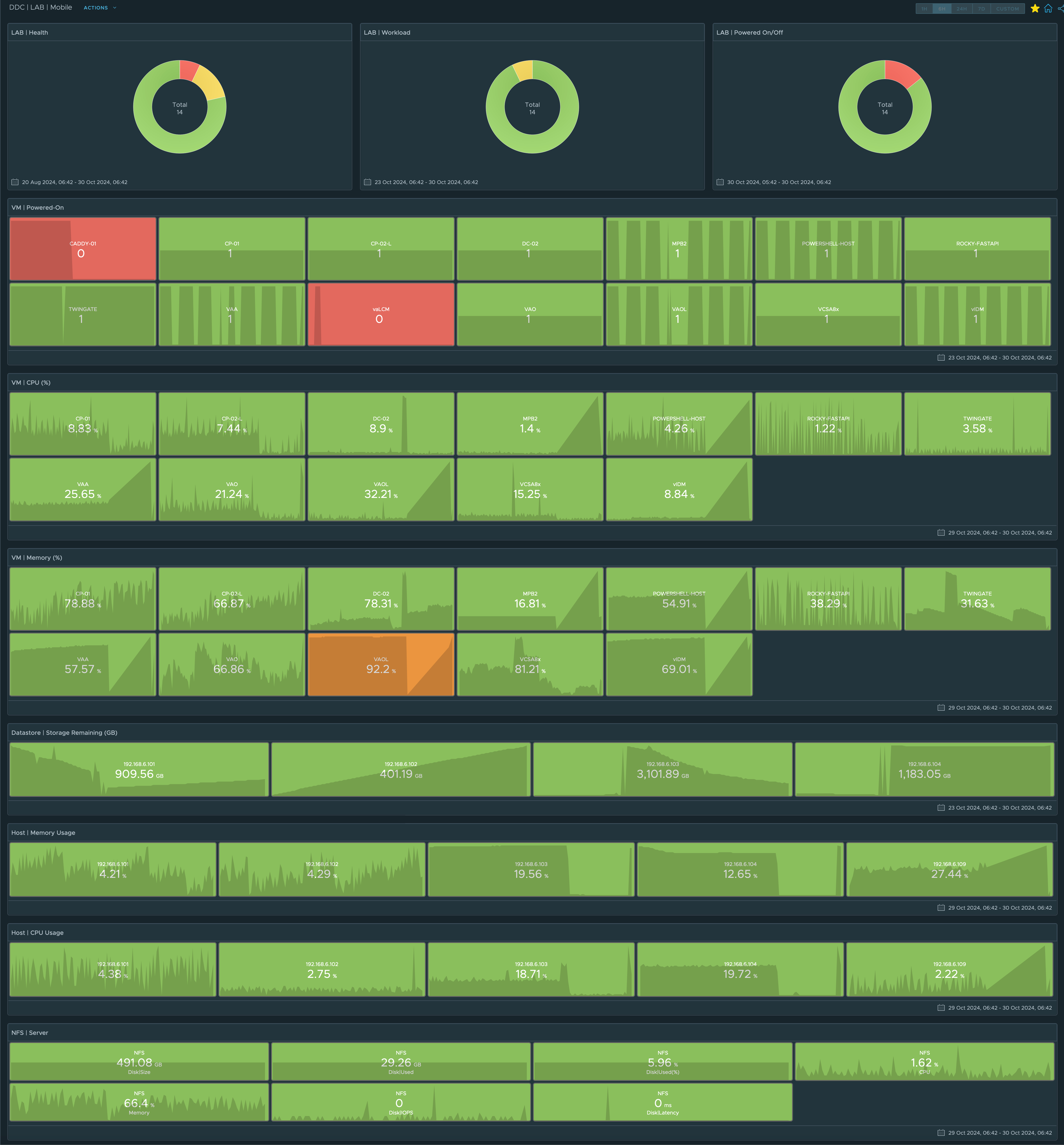
Dashboard: Environment Overview
- Designed to work on a mobile phone
- Use Color to get your attention
- Green is Good
- Red is Bad
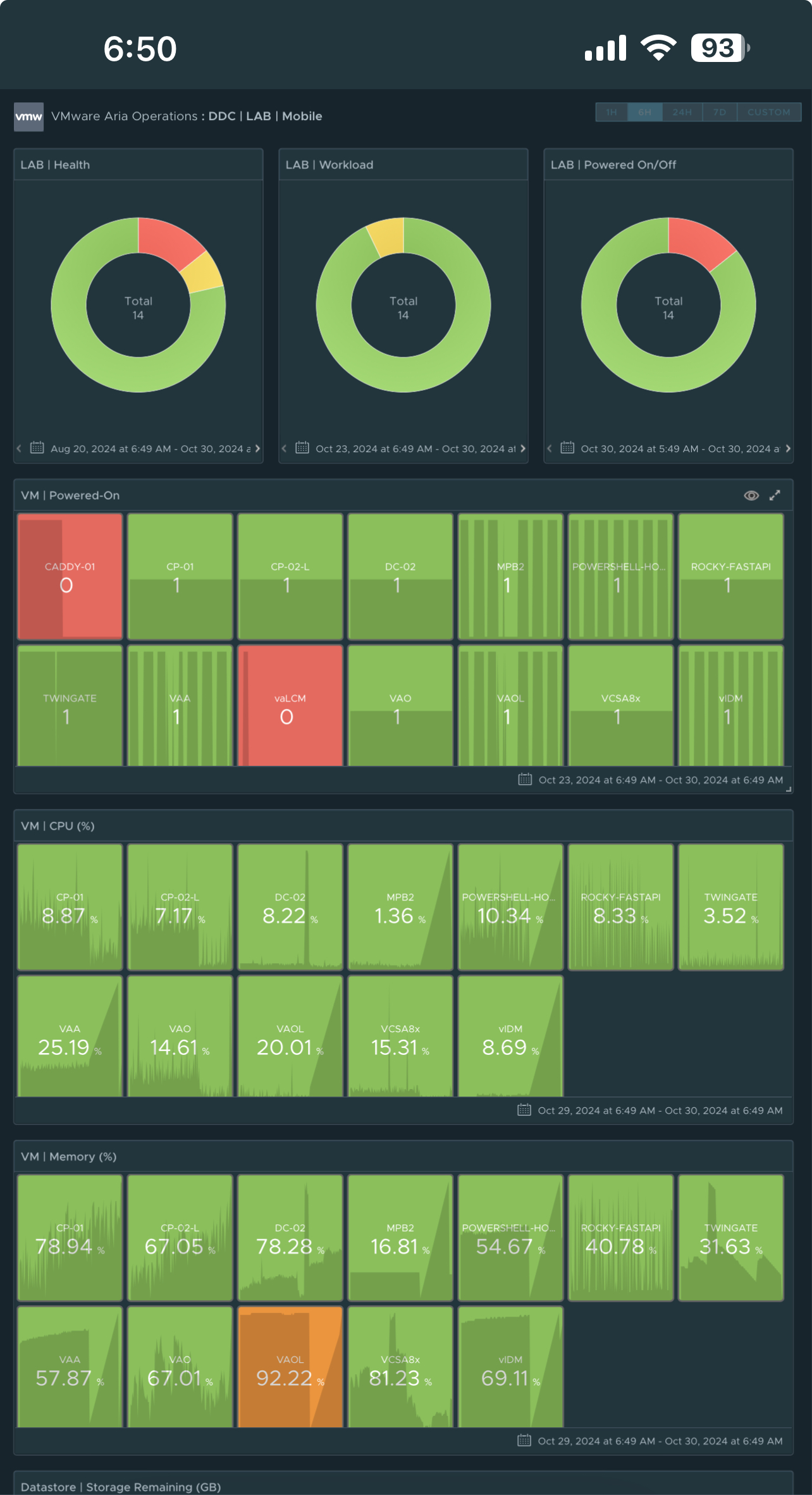
Dashboard: Environment Overview
- Same Dashboard as above but on a mobile device.
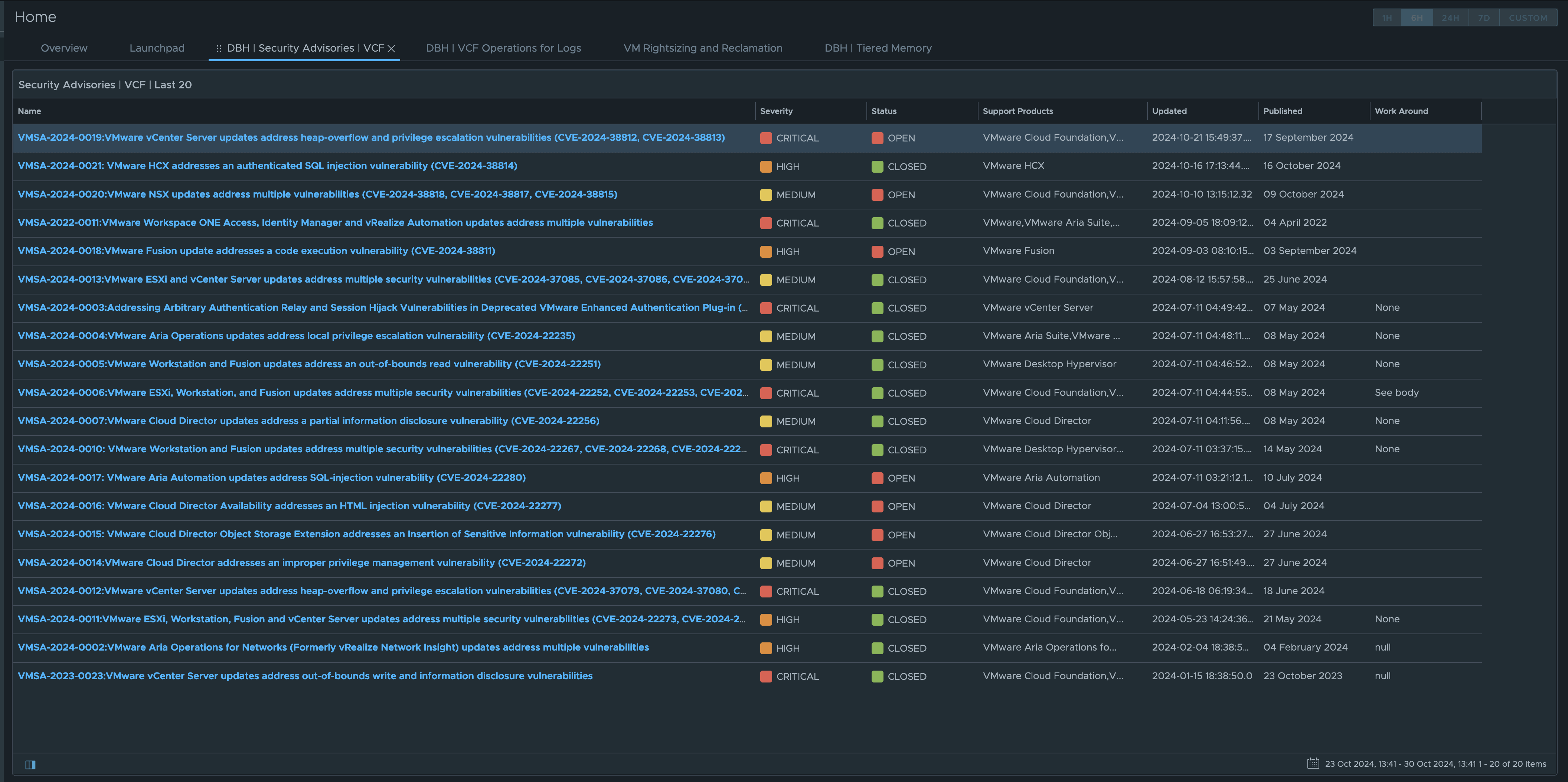
Dashboard: Security Advisories
- This Dashboard was created in conjunction with a custom Management Pack Builder MP
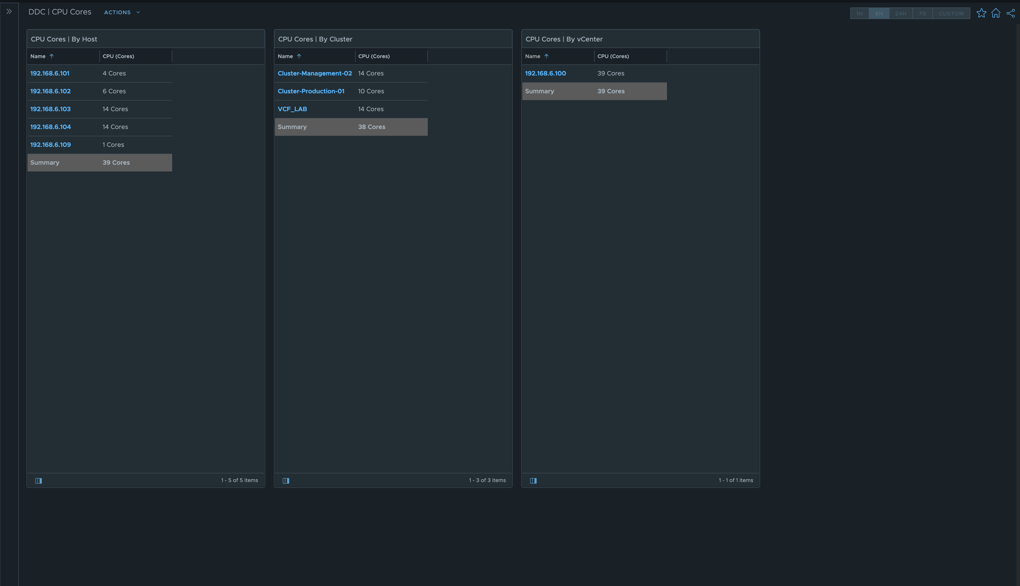
Dashboard: CPU Core Counts
- This Dashboard makes it easy to show current CPU Core counts to help with licensing
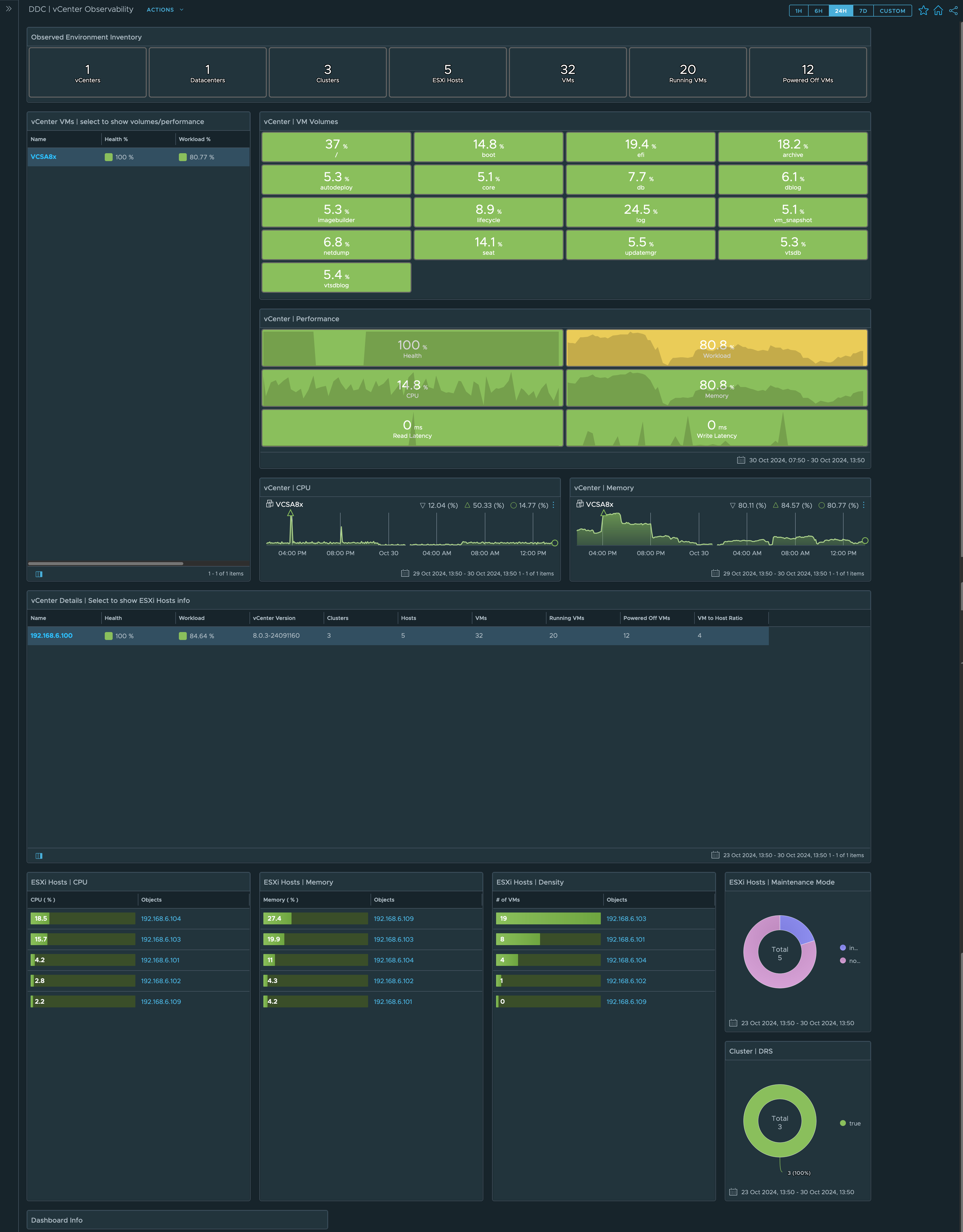
Dashboard: vCenters
- This Dashboard was designed to monitor vCenter appliance VMs only. VMs that are running vCenter.
- Shows vCenter VM Volumes and Performance
- Includes vCenter Host details at bottom of Dashboard
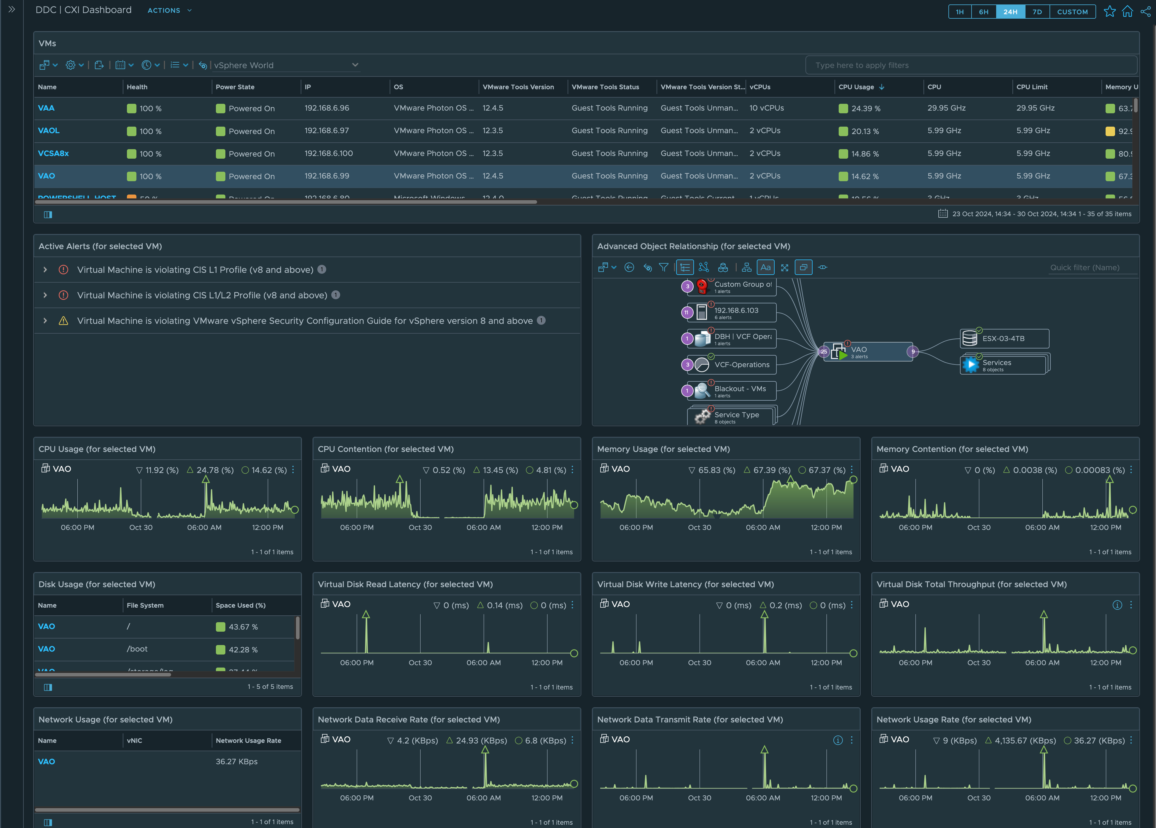
Dashboard: Virtual Machines
- Similar to some of the other Dashboards but this one includes some network metrics
- Example of what I said at beginning of this Blog, add or remove metrics to make the Dashboard work for you
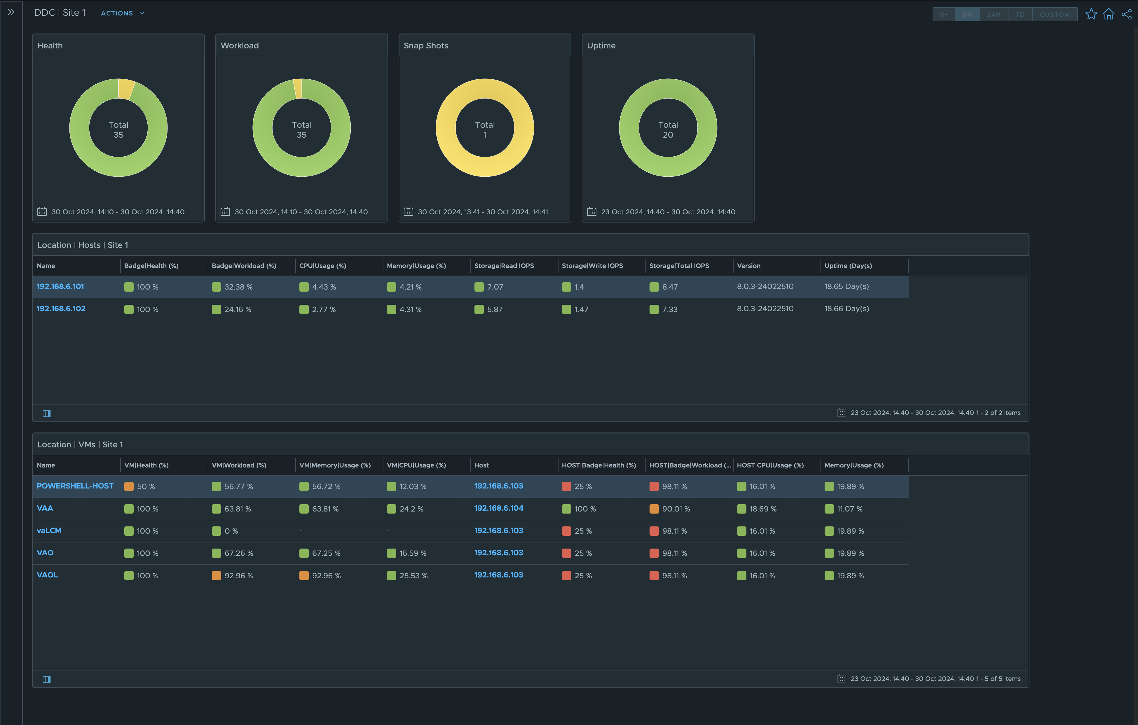
Dashboard: Edge Sites
- Show only items that are located in an edge site
- Use vCenter Tags to specify site location. vCenter Tags make it easy to group together objects.
- Look at the bottom widget in this Dashboard. In recent versions of Operations, they allow Ancestor/Descendants in views. You can show VM and Host metrics on a single line. That can be very powerful in troubleshooting.
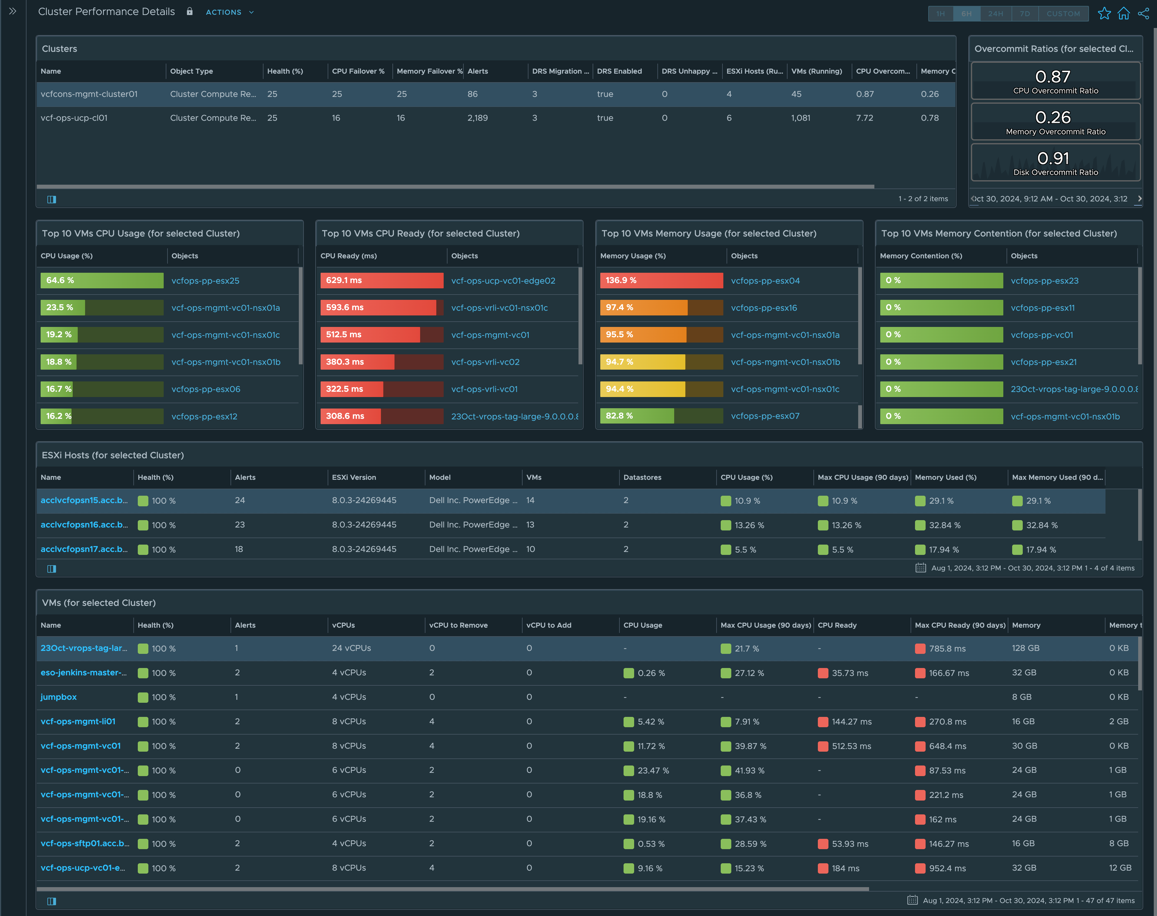
Dashboard: vCenter Clusters
- Use TOP-n widgets to show high cpu and memory usage first
- Set the metrics in the views to use colors to represent high or low values
- I like how new versions of Operations have the colored squares next to metric values
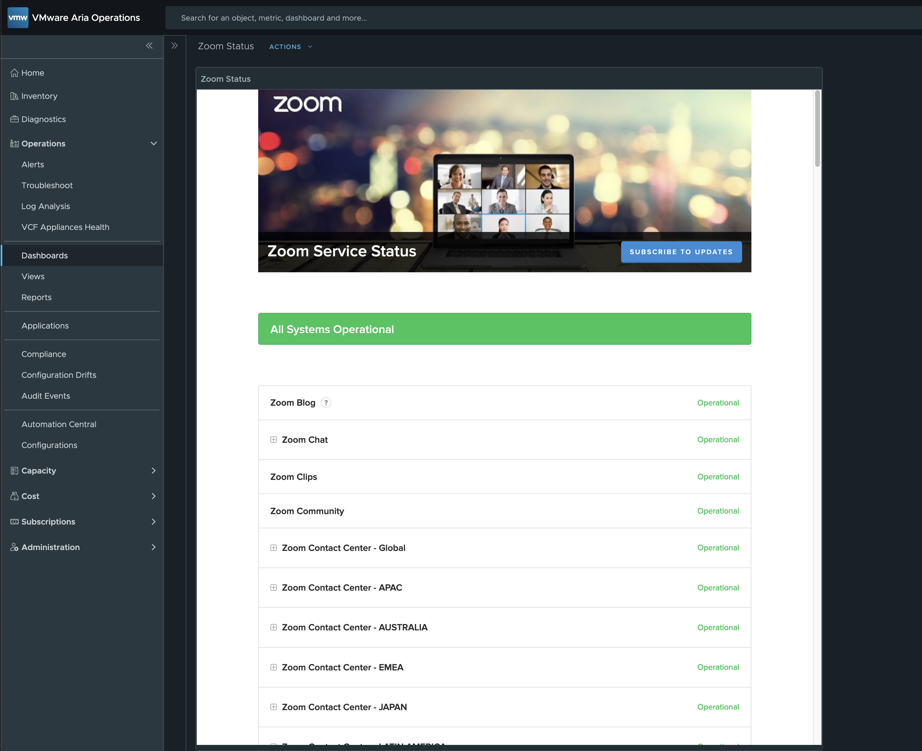
Dashboard: SaaS Status
- A lot of SaaS products offer a status web site.
- Use the text display widget to show web site information
Lessons Learned:
- Always think about using colors in your Dashboard Designs
- I love to use donut charts. You can show a lot of data in a small area of the Dashboard.
- The text display widget can be used to show data like Weather, Zoom Status, etc…
Links to resources that also show useful Dashboard examples:
- Brock Peterson Blog Site - Shout out to Brock for some of these examples and ideas.
- Shout out to Christopher Kusek for some of these examples and ideas.
I created a Google NotebookLM Podcast based on the content of this blog. While it may not be entirely accurate, is any podcast ever 100% perfect, even when real people are speaking? Take a moment to listen and share your thoughts with me!
vCROCS Deep Dive Podcast | VCF Operations | Ideas for Practical and Effective Dashboards